


Making an appealing visual identity for your company requires careful consideration of the font you use for your channel letter sign. You may choose the ideal font for your channel letter sign with the help of the advice and samples in this blog post. Whether you’re looking for a contemporary, tasteful, or fun font, we have what you need
I. Factors to Consider in Font Choosing for a Channel Letters
There are many things to think about while selecting a typeface for your channel letters. The typeface you select will affect how your sign appears overall and how much information can be presented.
Readability
This indicates that there isn’t a lot of contrast between the letters and other elements on the sign, and that they are sufficiently spaced apart to be easily seen. Make sure it is not too small or difficult to read from a distance in order for it to be legible from a distance.
Legibility
The typeface shouldn’t be too heavy or thin and should be simple to read. The complete text of your message should be shown on the panel without any words being truncated at the end of a line.
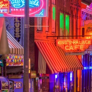
Visibility
In order to choose a font that is visible, you must consider the environment in which it will be placed. If the channel letters are placed under a canopy, they need to be highly visible from the street.
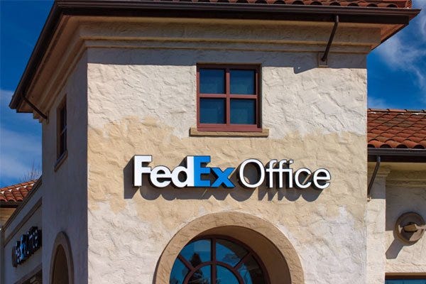
Branding
The typeface should express the same message and be consistent with your brand. Think about the font’s compatibility with your logo and its readability from a distance.
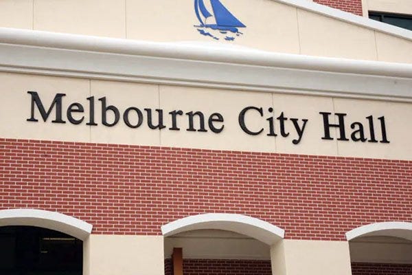
Style
Style is a major factor to consider when choosing a font for your channel letters. It’s crucial to pick a font that accurately represents the message you want to deliver because the style of your letters can significantly affect how your clients perceive the caliber of your company.
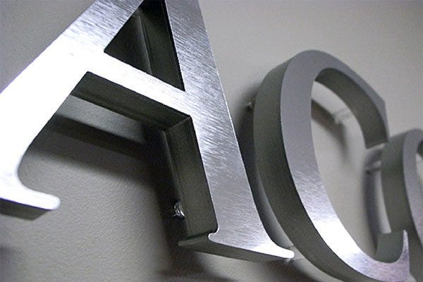
II. Fonts That Work Well for Channel Letter Signs
Helvetica
Helvetica is a versatile font that complements a wide range of designs. Moreover, it is quite simple to read, even from a distance.

Futura
The idea of geometric sans-serifs, sometimes known as “geometric” or “cold” typefaces, was initially used in one of the first typefaces, Futura. In graphics for transportation businesses like airlines and railroads, it has been employed.

Garamond
Garamond works well for channel letters because it has a clean, simple look that makes it easy to read. The serifs on the letters give the sign a classic, elegant feel that works well with most store designs.

Trajan Bold
The Trajan font is a bold, authoritative font that works well on channel letter signs. It’s a serif font and has a Roman style, so it’s great for channel letter signs that need to convey authority, like the name of a financial institution or law firm.
Myriad
The font Myriad is ideal for channel letters. It can be both bold and narrow, which enables it to blend into the majority of designs.

Rockwell
Channel letter signs look great when they’re written in the typeface Rockwell. Despite being bold, the font is still legible at a distance. It has a powerful presence and a retro vibe.

Verdana
Verdana is a sans-serif font that’s easy to read, but also has a friendly touch. It’s widely used, so it’s safe to use — and it’s got a clean, simple look that works well for channel letter signs.
Times New Roman
Even from a distance, Times New Roman is a dependable typeface that is clear and simple to read. Times New Roman is the font to use if you want to guarantee that everyone can read your channel letters. This is a terrific option if you want to make a statement with your signs because the font also looks amazing in all caps.
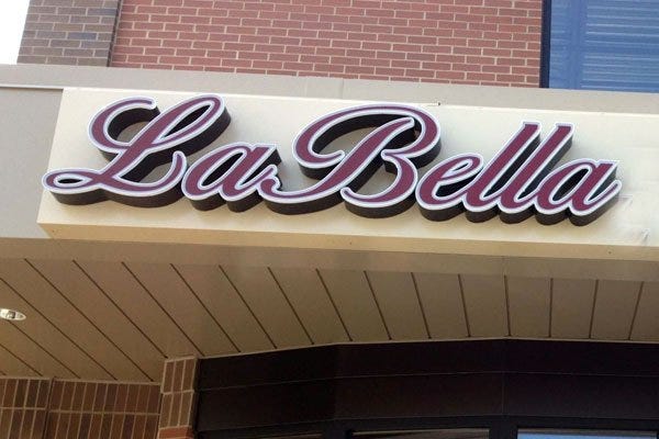
Script
Script fonts are a great choice for channel letter signs. They’re stylish, they look good on the sign, and they’re easy to read. If you’re going for that classic look, script is the way to go!
Clarendon
Clarendon is a serif font that has a traditional look to it and can be used in a variety of ways. It works well with channel letter signs because it has a bold look and is easy to read at a distance.

III. Tips for Selecting the Right Font for Your Channel Letter Sign
Know Your Brand Identity
When you’re looking for a font for your channel letters, it’s helpful to know what kind of vibe you want your brand to give off. Are you going for modern? Vintage? Old-fashioned? If you’re not sure, try looking at some examples of other brands that have similar qualities — you can use them as inspiration when making decisions about the fonts that might work best for you.
Consider the Location and Environment of the Sign
The location of your sign will have a significant impact on how visible it is to people passing by. Consider that, while you might want to put up a sign on a busy street corner, the lighting there may not be sufficient for your sign to be easily read. Similarly, if you’re planning on putting up a sign in an area with lots of trees or tall buildings, then you’ll need to consider whether those objects will obstruct sightlines from afar.
Keep it Simple
The location of your sign will have a significant impact on how visible it is to people passing by. Consider that, while you might want to put up a sign on a busy street corner, the lighting there may not be sufficient for your sign to be easily read. Similarly, if you’re planning on putting up a sign in an area with lots of trees or tall buildings surrounding it, then you’ll need to consider whether those objects will obstruct sightlines from afar.
Get a Professional Opinion
Getting a professional opinion is a great way to ensure that you’re making an informed decision when it comes to selecting the right font for your channel letters. You can always hire a graphic designer or sign company to help you with this task like LITASIGN.